

Empowering Fitness Beginners
As conversations about health and fitness increasingly find their way into our daily lives, I noticed a significant gap in the market for gym beginners and casual goers.
The idea for FitMine was born from a desire to make the gym experience more accessible and less daunting for this demographic.
/ Goals
Guide gym beginners through their fitness journey and motivate and support them every step of the way.
/ Tools
Figma, FigJam
/ My Role
UXUI Designer
UX Researcher
/ Timeline
Jun 2023 - Sep 2024
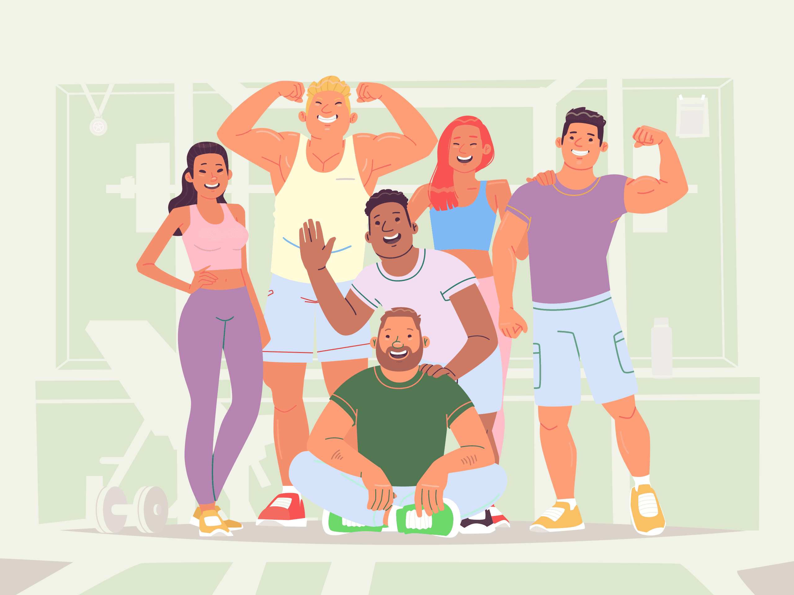
Gym People, Assemble!
Targeting gym beginners and casual goers, I sought to uncover their struggles, needs, and aspirations.
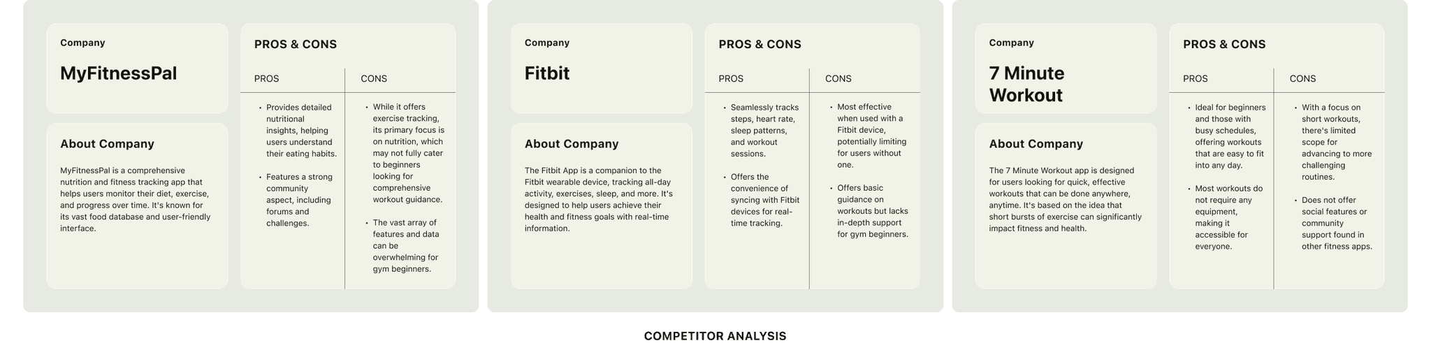
Let's See What's Out There
To understand its position in the market, I analyze its competitors, focusing on their offerings, strengths, and weaknesses.
FitMine is designed to fill a gap in the fitness app market by providing a platform that caters specifically to the needs of gym beginners.
It differentiates itself with in-depth workout guidance, a routine generator, and customizing options.
Now it's Our Turn.
I interviewed total of 4 gym beginners and 2 casual gym goers.
The goal was to Identify experiences users have before and while working out at gym, and to understand the motivations that casual gym goers have.
Personalized fitness plans are crucial for users to meet diverse goals preferences.

/ More Insights
Clear, accessible tutorials on exercise techniques and gym equipment usage are essential for beginners to feel confident and avoid injuries.
Effective progress tracking is key to keeping users engaged and motivated.
Based on the key insights, a primary user persona was created.

/ Sustainable
In crafting the visual identity of FitMine, a harmonious blend of color palette, UI choices, and typography was meticulously chosen to embody a youthful and sustainable brand ecosystem.
/ Youthful
To complement the color scheme and reinforce the app's youthful appeal, the UI design incorporates modern cartoon-style icons and tutorials featuring stylized, friendly characters.

How You Like That?
User Testing Participants: 9
Number of Tasks: 3
Goals: Evaluate the onboarding, generating a routine for back training, and modify the exericise "crunch" to "seated row" flows.
/ Onboarding
Success Rate:
100% could signup for an account and finish onboarding.
/ Get and finish a routine
Success Rate:
100% are able generate a routine for the focus area back, start, and finish the routine.
User Feedback:
The users misunderstand the Back titile as the Back button.
The instructions are too small.
/ Modify an exercise
Success Rate:
78% could modify the exercises, while 22% have encountered problems.
User Feedback:
The customize button is not obvious. They had a hard time finding where to modify.
It is unclear how to add a new exercise.
Continuous Improvements
The following screens show before and after images of changes addressing specific user feedback and misunderstandings encountered during the testing phase:
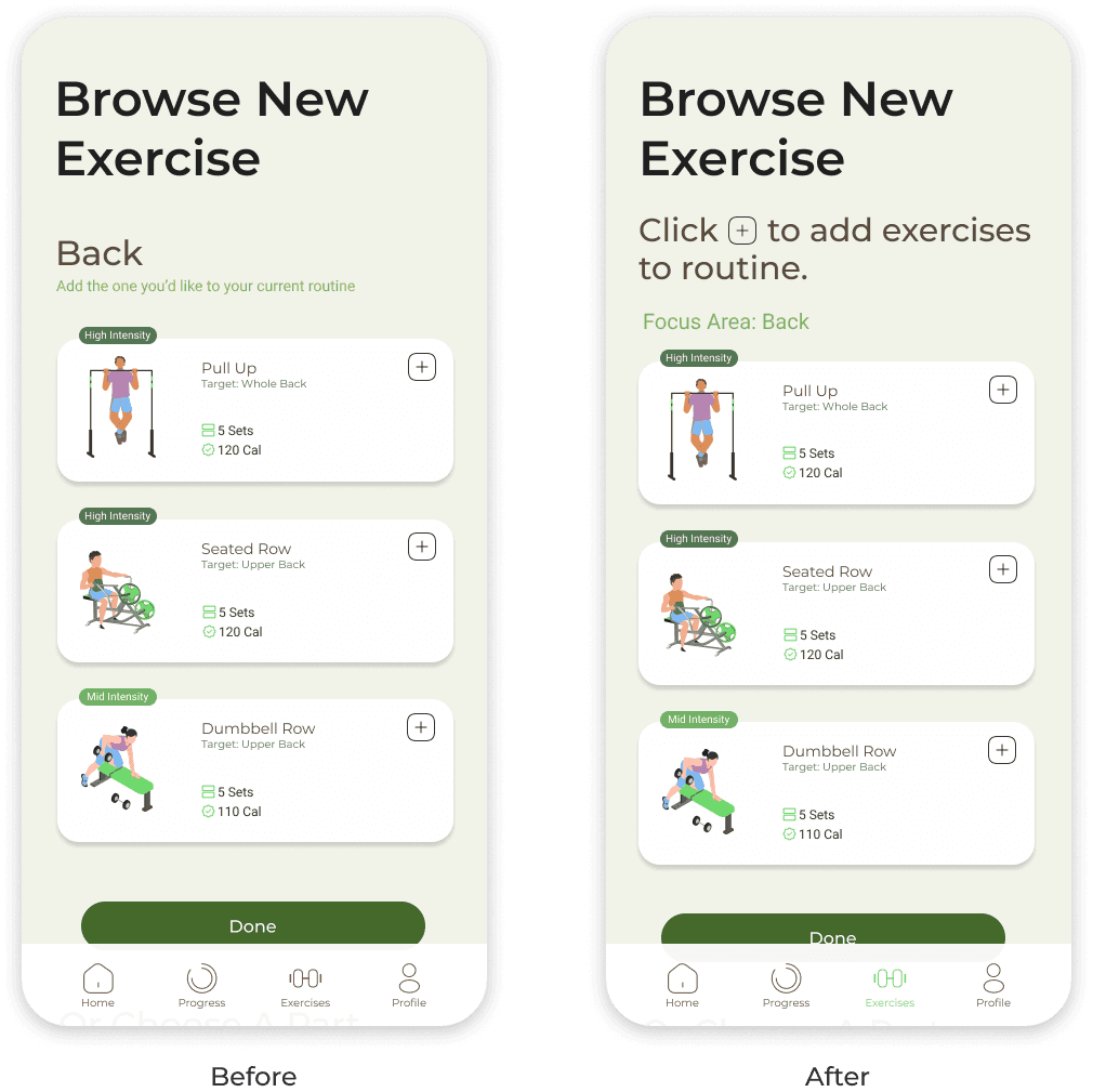
/ How do I add exercises?
Before: Users were unclear on how to add new exercises to their routine.
After: Recognizing that users at the modification stage are already familiar with their training focus, I shifted the focus to more actionable instructions by making them the title of the page.
To reduce cognitive load, I integrated an icon in the title that matches exactly with the one used on the exercise cards, ensuring a familiar visual cue for users.

/ Is it a button?
Before: Users confused the "Back" label, indicating the body training focus area, with a navigational back button.
After: I introduced a clear "focus area" title to the label, enhancing user understanding and preventing confusion.
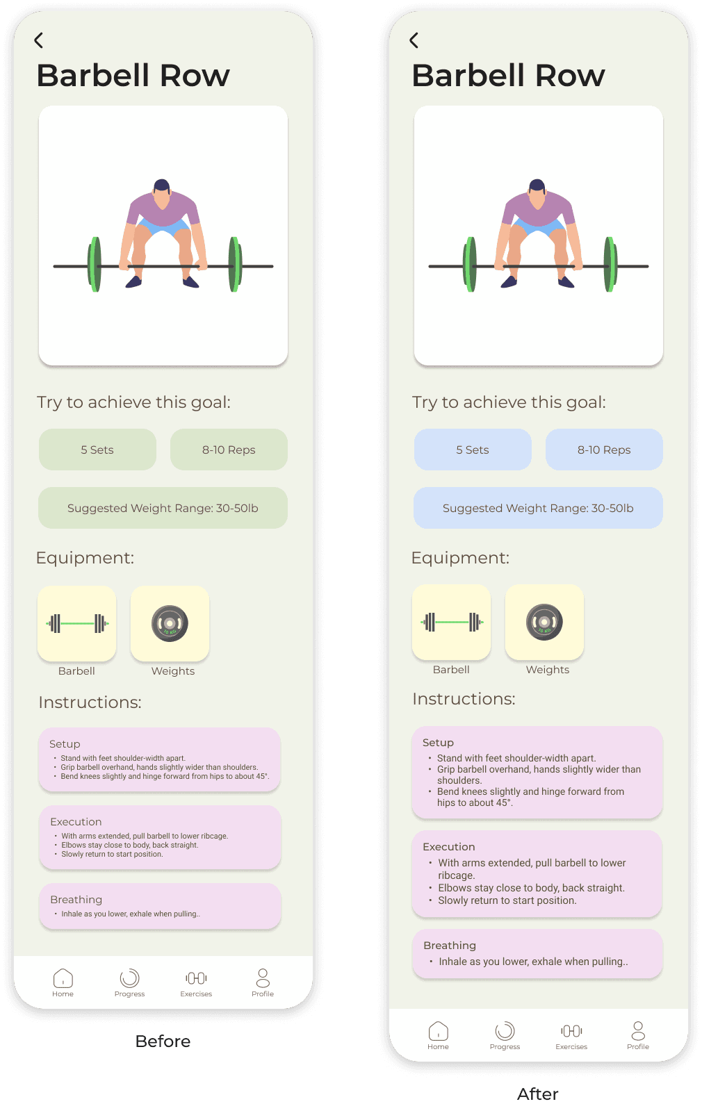
/ I want the instructions easier to read.
Before: The instruction font size was too small for comfortable reading.
After: I increased the font size, making instructions more accessible and easier to follow.
Before: Users found it challenging to distinguish between the "try to achieve this goal" cards and actionable buttons due to similar color schemes.
After: I opted for a light blue color for the cards to create a visual distinction.
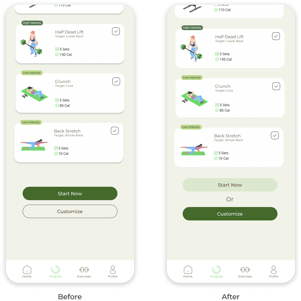
/ Do I have options?
Before: The customization button was not sufficiently prominent, leading to difficulties for users wanting to modify their routines.
After: I changed the button to the primary color, not only making it more visible but also encouraging personalization of routines.
What I've Learned
/ The Blend of Passion and Precision
The excitement of building an app from the ground up is undeniable, yet it's the meticulous research and data synthesis that truly form the backbone of effective design.
Passion ignites the process, but it's the careful analysis and understanding of user data that guide the development towards success.
/ Empathy in Iteration
A crucial lesson learned is the importance of empathy in design.
Putting myself in the users' shoes, I constantly asked, "How can this design be more "me"-friendly?" This mindset encouraged continuous refinements, focusing on reducing cognitive load and enhancing user comfort and intuitiveness within the app.
Looking Forward
/ Incorporating Dietary Guidance
While currently beyond scope, this feature is a pivotal next step as the product evolves.
Its inclusion will offer a holistic health approach, stressing the synergy between balanced nutrition and physical exercise, thereby addressing a critical user need as the app continues to expand.
/ Fostering Community Connection
Building a sense of community within the app is another objective.
By enabling users to connect, share experiences, and support one another, the app can become a more engaging and motivating space.
Get in touch